Green Day- Rock, Alternative Rock, Punk

Released in 2004, the print advert for Green days album 'American Idiot' is quite simplistic, in a cartoon style which doesn't have much detail. The majority of the print advert is black, a colour which conotates horror and evil, this contrasts with the white hand, making it look bold and stand out, this is a colour that makes us think of surrendering and emptiness. The last colour used is red, this could conotate pain, passion and hatred, combining these three colours and their connotations, the album artwork can be interpreted by the audience in different ways, such as looking at the way the grenade is in a heart shape, signifying that someone's heart is about to break, using the red to show the pain, which is highlighted by the blood. Whilst this grenade could be linked to the style of music, rock and punk, looking at the grenade as being dangerous and about to explode, as if the music will be big, important and maybe even revolutionary. Overall the artworks style and colour is very eye catching and dramatic.
This artwork which is on both the album front cover and print advert, relates to the lyrics 'She's holding my heart like a grenade' in the song 'She's a Rebel' which is featured in the album. The bands name is written in a bold white font is capital letters, this makes it stand out, grabbing the audiences attention and stating their importance. Whilst the albums name is below in a smaller, red font which isn't as eye catching, but is still bold, using the red continuing the colour theme.
Radical Something
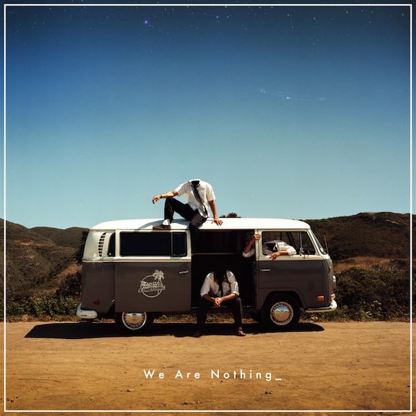 There first album release was in 2009 with "sundown" there newest album in 2012, this album was called "hwe are nothing and is a very original and different album advert, as you can see in the picture bellow the 3 main members of the band are sat in/on there broken down van, their heads have also been edited out to conotates with the album name "we are nothing" which is shown by unidentifiable people sat idol by the road. But in contrast the setting is on a California country/seaside, blue sky's and a sunny day which is a highly contrasting picture to the name and the conatation of the album.
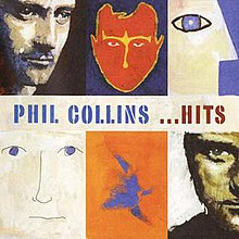

 Above on the right hand side is the cover for one of Damien rices albums, he created all of his Digi packs in the same way, so that the were as simple as the previous, cost less to make, and were easier to sell, with all of his album adverts and his Digi packs he used similar sorts of imagery either painted or printed to create the strange effect he wanted his albums to have with gave them a "niche" when being sold in larger stores such as HMV, Play.com, Sainsburys, Tesco's ect. when i came across his Digi pack it reminded me of an album my father had in his car when i was younger by Phil Collins he too used this sort of printed imagery and basic simple Digi packs as he felt it made it unique to his consumers. when looking at there advertisement for there albums the same plane imagery is used, this is a popular aspect when it comes to print adverts due to the fact that simple adverts are much more attractive to the reader when flicking through a magazine because they are easy to look at. There tends to be a small amount of text, seeing as large amounts can put off the reader, so it is no surprise that there is little text on Damien Rice's advert, stating the albums name and the title of one of his singles. The font is also plain and easy to read, another similarity i have noticed between Damien s and Phil Collins is that all the text is written in capitals, this is their way of trying to grab the viewers attention being more dominant to make it stand out.
No comments:
Post a Comment