
Here is the digipak for taylor swift album RED, the imagery shown throughout the pack is very girly and sweet , this new imagery has a mixed telation to the music style and genre, the new album is still fitting into the same music genre Pop. A strong close up of Taylor swifts face is used for the front cover of her album, though her style and star image has changed dramatically, the close up insures that the viewer recognizes her straight away. Seeing as she is a very well known, famous and attractive artist her face sells, using a close up for the album cover draws in her fans encouraging them to buy the album just because it has her photo and name on it. Because of her huge fan base she is able to change her style constantly without risking loosing her fans, this change also makes her interesting and stops people from getting bored of her, her bright red hair will make her album stand out when displayed in a shop with many other albums.
The whole digipak follows girly theme, the use of colours like pink and red throughout the new digi packs suggests a them of lust and romance in her songs, the album also comes with 4 guitar picks this can encourage the people who buy the album to take up music as a hobby but also is a way of selling the product, because at the end of the day if a product comes with a few items for free it its increases our want or desire to have it, its a cleaver marketing strategy called
freebie marketing or razor blade business marketing.
The text used on the album cover is very plain, in a simple red and white font across the middle and bottom of the photo, it doesn't stand out, which means that the photograph grabs the full attention of the viewer and the text is not a distraction.


Above is the digipak for Spiritualized album 'Ladies and Gentlemen We Are Floating in Space' it is presented in the form of a prescribed drug box, this album fits into the music genre 'space rock'. The digipak is very convincing,, the image on the front is very simple in a dark blue whilst the band name is written in a large plain font across the top, the album title written in a much smaller font below. Across the bottom in very small text is written '1 tablet, 70 mins'.
Inside the box is a plastic container with foil sealing it, this similar to the packaging that for instance paracetamol or ibuprofen , there is also a small folded leaflet similar to the ones inside a box. To make this look realistic there are no images or fancy fonts, the whole leaflet is written in a small black font which contains all the information about the album. This album does not include any lyrics for the songs, lyrics are usually seen in pop albums, where the audience may want to sing along. By looking at this digipak it is clear that the band is not worried about their image, this is very different to Taylor swifts digipak above which includes many photographs of her, seeing as her appearance is very influential on her younger target audience, where 'her face sells'. Spiritualized do not include any photographs in their digipak, this may be because they are more focused on their music than their appearance, or because as people they may not have a different style or look which will make them stand out in a crowd.


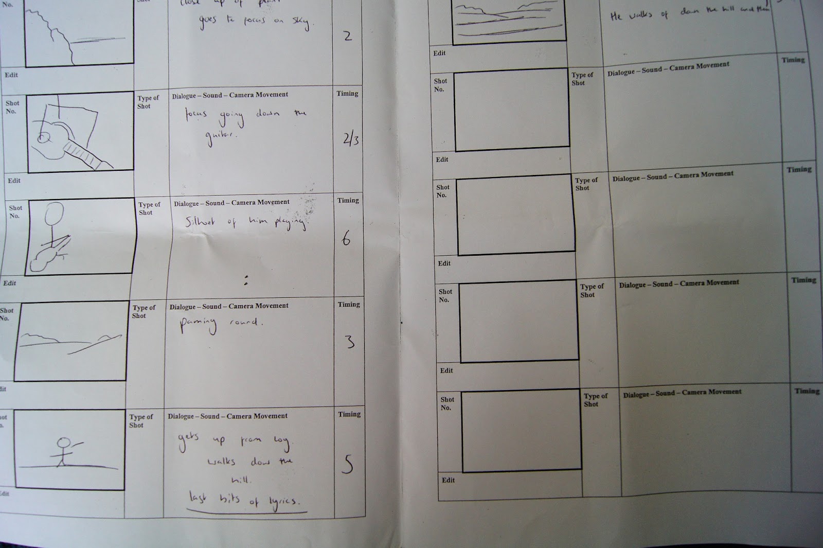
 In the first edit i had 2-3 gaps, these have been filled by shots of time lapses, these i felt helped to show the passing of time and maybe gave a feeling of isolation to the video. once i was happy with the editing i then went about sharpening up all of the clips, as i had created an extension format of 1080p HD quality i wanted all of the images to be crystal clear as this gives it a more professional look.
.jpg)


.jpg)


 I only wanted one picture on the inside of the digi pack, mainly because i personally thought it looked better and because of the minimalist theme i wanted to follow when creating the digi pack.


 For my media A level music video i will be using new and modern technologies in editing such as Adobe after effects and Adobe premier pro, mainly because of the huge variety of editing techniques available and the more simple, brightness and contrast, B&w, clone stamp tool, layering, transition effects, music mixers volume output controls, because of the ability to manually manipulate the imagery in the editing sweet i was able to create the perfect effects that i had originally planned out for my video even if the sound quality was damaged or the camera was shaky i could fix it through the editing software. This i feel made my video more unique and gave it alot more of a proffesional look and feel when watching the final product.


.jpg)
 The voice of the song, the artists voice is extremely unique and
can form identification or trademarks to that particular artist or record
label.
The voice of the song, the artists voice is extremely unique and
can form identification or trademarks to that particular artist or record
label. He says that the narrative and performance aspects of
the video should work together to compliment each other and cut between them
constantly to make the video easy to watch over and over without the audience
getting too bored.
He says that the narrative and performance aspects of
the video should work together to compliment each other and cut between them
constantly to make the video easy to watch over and over without the audience
getting too bored.
 Fredrick Wertham is
a theorist who released a book in 1954 highlighting how comic books are a
'negative form of popular literature'. He argued that they included both covert
and overt violence, sex, drugs and crime, he also highlighted the hidden sexual
themes such as wonder woman having a bondage subtext, which was admitted by
creator William Moulton Marston.
Fredrick Wertham is
a theorist who released a book in 1954 highlighting how comic books are a
'negative form of popular literature'. He argued that they included both covert
and overt violence, sex, drugs and crime, he also highlighted the hidden sexual
themes such as wonder woman having a bondage subtext, which was admitted by
creator William Moulton Marston. 


 Here is the digipak for taylor swift album RED, the imagery shown throughout the pack is very girly and sweet , this new imagery has a mixed telation to the music style and genre, the new album is still fitting into the same music genre Pop. A strong close up of Taylor swifts face is used for the front cover of her album, though her style and star image has changed dramatically, the close up insures that the viewer recognizes her straight away. Seeing as she is a very well known, famous and attractive artist her face sells, using a close up for the album cover draws in her fans encouraging them to buy the album just because it has her photo and name on it. Because of her huge fan base she is able to change her style constantly without risking loosing her fans, this change also makes her interesting and stops people from getting bored of her, her bright red hair will make her album stand out when displayed in a shop with many other albums.


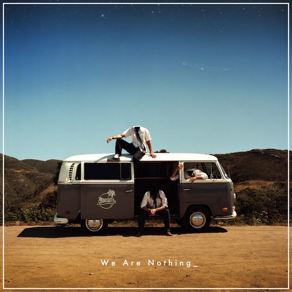 There first album release was in 2009 with "sundown" there newest album in 2012, this album was called "hwe are nothing and is a very original and different album advert, as you can see in the picture bellow the 3 main members of the band are sat in/on there broken down van, their heads have also been edited out to conotates with the album name "we are nothing" which is shown by unidentifiable people sat idol by the road. But in contrast the setting is on a California country/seaside, blue sky's and a sunny day which is a highly contrasting picture to the name and the conatation of the album.
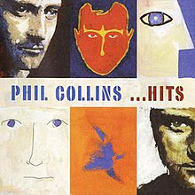

 Above on the right hand side is the cover for one of Damien rices albums, he created all of his Digi packs in the same way, so that the were as simple as the previous, cost less to make, and were easier to sell, with all of his album adverts and his Digi packs he used similar sorts of imagery either painted or printed to create the strange effect he wanted his albums to have with gave them a "niche" when being sold in larger stores such as HMV, Play.com, Sainsburys, Tesco's ect. when i came across his Digi pack it reminded me of an album my father had in his car when i was younger by Phil Collins he too used this sort of printed imagery and basic simple Digi packs as he felt it made it unique to his consumers. when looking at there advertisement for there albums the same plane imagery is used, this is a popular aspect when it comes to print adverts due to the fact that simple adverts are much more attractive to the reader when flicking through a magazine because they are easy to look at. There tends to be a small amount of text, seeing as large amounts can put off the reader, so it is no surprise that there is little text on Damien Rice's advert, stating the albums name and the title of one of his singles. The font is also plain and easy to read, another similarity i have noticed between Damien s and Phil Collins is that all the text is written in capitals, this is their way of trying to grab the viewers attention being more dominant to make it stand out.